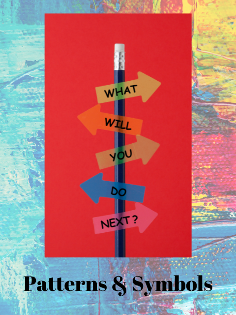
We have seen how subliminal decorating patterns build or burden energy in our decorating. Now, in Patterns and Symbols in Decorating, Lesson VII, D – What to Do, we can see how to corral our symbols to create a more pattern-based living space.
Example 1 – What to Do
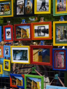
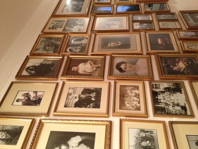
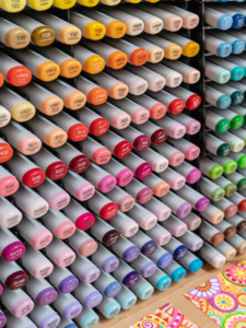
Everyone has pictures of their family and friends, travels and momentous occasions scattered around their home or office, usually in color. We have learned in The Gestalt Laws of Perception, Lesson V that the eye seeks out like things and uses them as a fixations (The smaller than nanosecond time the eye rests on one part of the visual field.). Color, via the Law of Similarity, pulls the eye to it as a fixation and repeated fixations create a scaffolding. Designers manipulate that aspect of the eye/brain when they repeat a color throughout a room. The problem with colored photos is that they are a mixture of colors, and they are impossible to site strategically for a good scaffolding.
When we have lots of colored photos scattered about, it is challenging to the eye. Now, people love their photos and indeed they are nice ego symbols. Nonetheless, they create fixations that do need to be corralled before the eye bounces all over the place. Not every group of pictures is a good pattern. I find the above photos problematic in creating a harmonious space.
Several things we can do.
- Display fewer photographs. Keep some in a drawer and rotate them.
- Frame the photographs in a uniform color and style with a dominant, thick frame (Law of Similarity.) Keep them close together to contain them as a unit. (Law of Proximity.) Place them on a nice tray (the Gestalt law of Common Region) of the same color and material as the frames. Small fixations are seen as one, relaxing the eye. If pictures are in the office, pin them on a cloth-covered bulletin board. Each photograph should have the same color matting or edged backing.
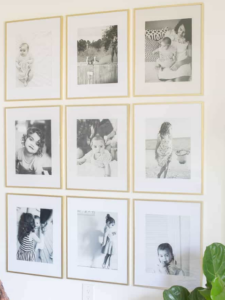
- Change from color to black and white, sepia or muted antique colors, and use the same type of frame on each, though not as thick. They may be placed throughout the room grouped or in a harmonious path.
We shouldn’t try to live without our symbols. Healthy forms of symbol-seeing may be souvenirs from trips, refrigerator magnets, grandma’s dishes, various knickknacks, and family photographs grouped on a living room table or on the wall of an office cubicle.
Still, no matter how good the symbols are, if their placement does not uphold a harmonious scaffolding, they take down the design and rob it of energy.
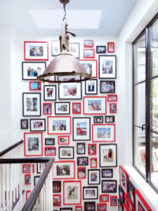
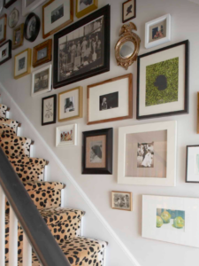
Some Good Examples
Example 2 – What to Do
Perhaps the most prolific examples of symbol-seeing are related to raising children. Their egos are developing every moment and need to be strengthened. Ego symbols must be visible as reminders. Children forget what is not in front of them. Too many symbols, though, make a harmonious environment hard to create. We must maintain and support the child’s innate ability to relate to patterns and create an environment that promotes calm
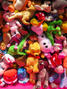

Unaddressed children’s areas are soon filled with bins spilling Legos and horizontal surfaces covered with the purple and pink plastic remains of princess mythology and action figure toys.
.

Eventually, children’s symbolism fills the rest of the house with refrigerator magnets, layers of scotch tape attached to drawings on every vertical surface, and scattered toys and ubiquitous plastic childcare paraphernalia in primary colors. Harmonious scaffolding and peace are lost when needed most.
Symbols placed without acknowledging the scaffolding do more harm than good. We need not eliminate them, but we do have to contain them. We can buy plain containers to house the various play materials of our children’s lives. If time permits, we can sort them and teach our children to do the same.
Words of Wisdom
“The secret to coming up with a good room for a child is respect,” wrote John Wheatman in Meditations on Design. For example, he said, a drawing or painting stuck among other things on the fridge won’t seem special. Wheatman recommends using frames to display some — not all — of the child’s artworks. The works can be replaced as others are completed
Elevating the Ordinary
To create art, children are often given such lifeless materials as crayons and construction paper. For just a bit more money when I taught children, I found tinted papers without that dull, dusty construction paper look. Water-based markers can be improved upon as well. We can at least buy sets with more than primary colors. Some sets may cost more but are exquisite and worth it. (Consider two safe products: water-based Tombow or alcohol-based Copic markers.)

When the materials are elevated, a child’s construction becomes a noteworthy piece of art, and children’s art can be quite spectacular. In his later life, Picasso visited an exhibition of children’s drawings and he observed, “When I was their age, I could draw like Raphael, but it took me a lifetime to learn to draw like them.”
Giving Respect to Children’s Rooms
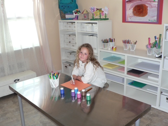
To calm and inspire our children, we should consider elevating their environment, too. Next, see an art room I designed to hide all art materials in boxes and containers, reducing the number of eye fixations. To further enhance the harmony, all the shelves and boxes were white. The only color was the children’s works arranged on the top of the shelves.


*****
Finally, let’s consider giving children toys based more on patterns than symbols. A childhood story of Frank Lloyd Wright’s illustrates why. His mother gave him a set of blocks that he believed made him as astonishingly creative as he was. Friedrich Froebel, the German education reformer who created the word “kindergarten” and its idea, designed the blocks in the 1830s to cultivate and shape young imaginations.
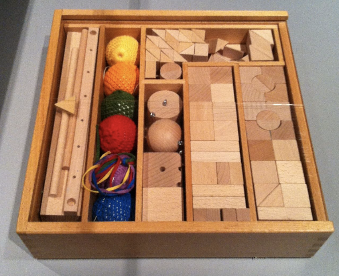
The effect on Wright’s creative ability was astounding, for he credited these blocks to all his future works:
“Mother learned that Friedrich Froebel taught that children should not be allowed to draw from casual appearances of Nature until they had first mastered the basic forms lying hidden behind appearances. Cosmic, geometric elements were what should first be made visible to the child mind.
The virtue in all this lay in the awakening of the child-mind to rhythmic structure in Nature – giving the child a sense of innate cause-and effect otherwise far beyond child-comprehension. I soon became susceptible to constructive pattern evolving in everything I saw. I learned to “see” this way and when I did, I did not care to draw casual incidentals of Nature…I wanted to design.”
Example 3 – What to Do
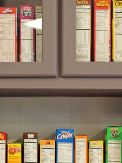
Everything we see registers through our eyes and minds. Our organs of perception initially take in only a few fixations. The more we have in our visual field, small and big, the more difficult it is to create a harmonious path. This includes intrusive advertising. One of my favorite interior designers Barbara Barry of BB Holmes hides cleaning supplies into unmarked containers: “Why should I advertise Tide,” she explains.
The lesson is to hide our toothpaste and shampoos, and use a design-appropriate bathroom soap dispenser instead of a dishwashing bottle on the kitchen sink. It is doable but difficult to create a good scaffolding with an ad logo. Jerry Seinfeld did it by keeping all his cereal boxes together behind a frosted glass door. Andy Warhol transcended advertising by doing the scaffolding in paintings and prints. Better to hide the stuff.
Excessive use of ego-symbols, however, like advertising logos, can create an overwhelming number of fixations, leading to greater difficulty in upholding a harmonious scaffolding. We neither want nor need advertising logos as messages to our subliminal self. One of the purposes of metaphysical design is to create healthy symbols based on patterns that affect us positively.
Example 4 – What to Do
A Thinking Exercise
The following exercise is to see how beauty and status affect energy.
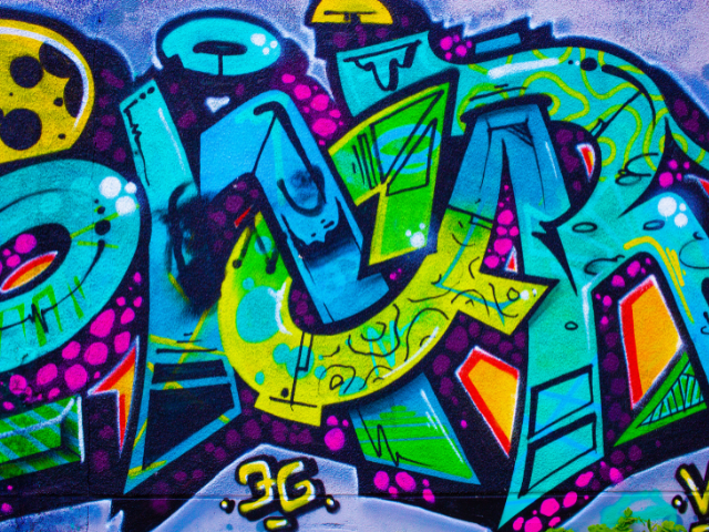
I have always loved graffiti and taught my students to paint in that style. (Always with the understanding, of course, never to paint on property without permission.) Graffiti is not loved by all, unfortunately. In the ’80s, I was helping a friend, Jerome Weinberger, as he designed an avant-garde exhibit for Tiffany’s windows. I mentioned to the legendary window-dresser Gene Moore, who oversaw the project, to use Graffiti for a display someday. I could just see Tiffany’s $50,000 baubles protruding through the stars commonly adorning a graffiti piece.


Moore, a very fine gentleman long passed now, gently pushed aside the idea. I saw in his eyes that graffiti to him was low class, a product of poor neighborhoods often associated with vandalism. My idea was too early. Twenty years later, highly collectible graffiti artwork by Keith Haring, Dela Vega, and Bansky were commanding top prices.
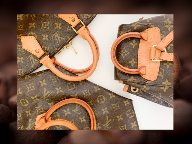
I would rather see good graffiti than a Hermes scarf or a Louis Vuitton bag.
That is just me; we all have our own idea of what’s important.
The big question is whether we’re choosing the object for its beauty or for its status. We begin to lose our eye for pattern, like the Greek Revival builders did, when we design for status.
My Choice Led Me to a Find
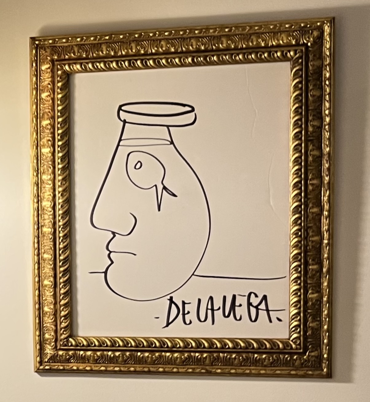
Some New Yorkers love garbage for the treasures they occasionally find. The search is not a hobby for the status-minded.
One day walking I passed a garbage heap, I spotted a discarded poster with Magic Marker drawing on the back. The now famous De La Vega used to draw on sidewalks in chalk, so I recognized his work on the poster. I got out my trusty Xacto knife, a necessary tool for the garbage picking artist, and freed the treasure. I hung it framed in UV-protection museum glass and away from direct sunlight.
When people exclaim, “How did you get this? What did you pay,” I just smile.
What is Beautiful; What is Status; When are They the Same?
In design, a great many artifacts pose as status symbols. I write mostly about interior design, but clothes, cars, and jewelry are useful to study because it’s easier to recognize their status value. So, I ask these questions:
- Am I attracted to it because of its beauty or its status?
- If its status were removed, would I still find it beautiful?
- Could I find beauty in a rockpile, street graffiti, or something else that can’t be a status symbol?
- Can I tell that a status item lacks aesthetic appeal?
- Does the logo detract from the beauty of the item’s design?
- Is the logo itself beautiful?
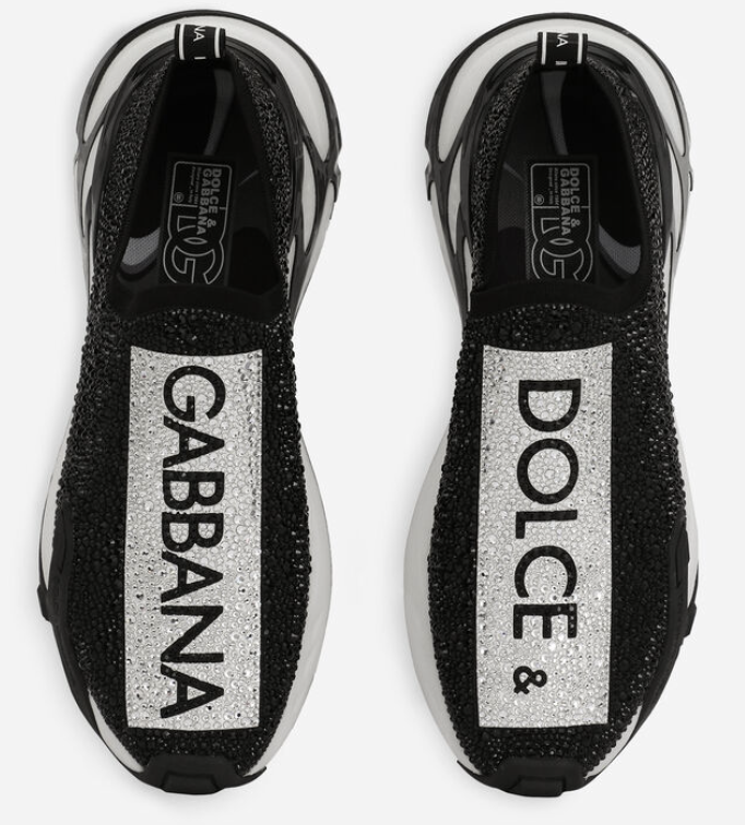
The Signal
The logo is another component to most items with status. It’s sometimes just the logo that’s in demand, as for the Dolce & Gabbana rhinestone sneakers. The wearer advertises them but enjoys little pattern beauty that emits even less energy.
For many egos, the need to display a product’s status is overwhelming. Hordes try to show the world that they are worth more than they think they are worth. Some squeeze or strangle their budget. One person I know bought her third Louie Vuitton bag when her rent was months overdue. Another acted out her Sex and the City fantasy by wearing Christian Louboutin shoes at her wedding. That meant, however, that the small reception’s hors d’oeuvres were just cheese and crackers. [No trans-fat in Saltines. I looked it up. No fat in them at all.]
People who can’t afford the logos turn to cheap knockoffs. They fuel a huge demand for counterfeit apparel.
.
Logos as Symbols
Logos are symbols. Some are rich in pattern, but their purpose is to pose. Jonah Berger, in the bestseller Invisible Influence, the Hidden Forces that Shape Behavior, calls these logos signals to convey status. The louder and larger logos make them easy to counterfeit. Berger notices an irony: a logo toted by too many stops signaling.
As people spend on a designer logo they can’t afford, the wealthy move on. For way more money, they buy logos so subtle only they spot. The most expensive Mercedes as a much smaller hood ornament. For every $5,000 increase in price, Berger says, the logo shrinks by a centimeter. Subtle branding creates exclusivity.
It’s almost laughable. The elite spend extra on logos until the wannabes copy them, forcing the elite to diminish or eliminate it. Certainly Dr. Seuss thought so.
The Sneetches
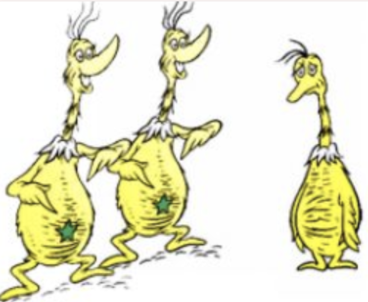
Dr. Seuss’s poem The Sneetches tells about a community of yellow, goose-like creatures. Some Sneetches happen to have a green star bellybutton and shun the other Sneetches as inferior
Then a mustachioed, bow-tied Sylvester McMonkey McBean invents the Star-On machine to put stars on Sneetches for three dollars.
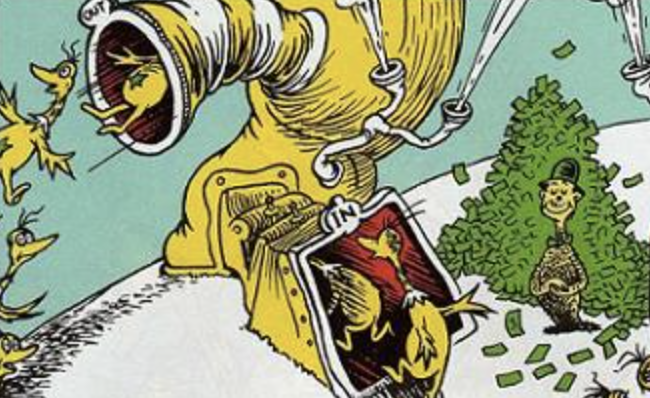
It’s popular, and the starred Sneetches watch their special status fade. So McBean invents a Star-Off machine and charges ten dollars to remove a Sneetch’s star. Soon, that machine is popular, too.
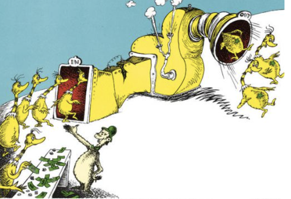
However, McBean does not share the prejudices of the Sneetches and allows the recently starred Sneetches through this machine as well. Ultimately this situation escalates, with the Sneetches running from one machine to the next…
“…until neither the Plain nor the Star-Bellies knew
whether this one was that one… or that one was this one…
or which one was what one… or what one was who.”
Soon, all Sneetches are penniless. McBean departs rich and laughing at the folly. Despite his assertion that “you can’t teach a Sneetch,” the Sneetches do learn that neither plain-belly nor star-belly Sneetches are superior. The race to prove superiority ends, and all Sneetches, starred and unstarred, become friends.
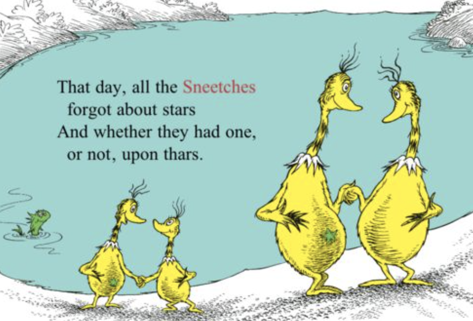
If only the human race, could behave like Sneetches
Interior Design
In interior design, furniture and other parts rarely come with logos. Viewers just know design status.
I remember something one of my students told me in 2005. Bernie, from the inner city, New York, had moved from the South Bronx to Manhattan. Suddenly his status was poverty. It was the windows that got him. The apartments’ high ceilings and tall windowed walls made saddened him because he wanted something he couldn’t attain. It made me feel guilty since he was passing my neighborhood on his way into Manhattan.
My husband-to-be bought our postage stamp apartment in the late ’80s when he didn’t think he would ever marry again. At the time, the neighborhood was considered on the edge of the inner city. Over time, it gentrified and over time we got married. Now we did not have tall windows but the area became highly desired.
Decades later, Bernie probably has more room than we have. I have no room for a dresser or toaster oven or more than five pairs of shoes. Our kitchen is in the living room. I like the challenge. We don’t have large glass windows, but we have a safe environment. We also don’t have sadness.
Today’s Walls of Glass
Fast forward from the late ’80s, tall, thin, pencil towers are popping up everywhere in the southern Central Park area. New Yorkers now call it Billionaires’ Row.
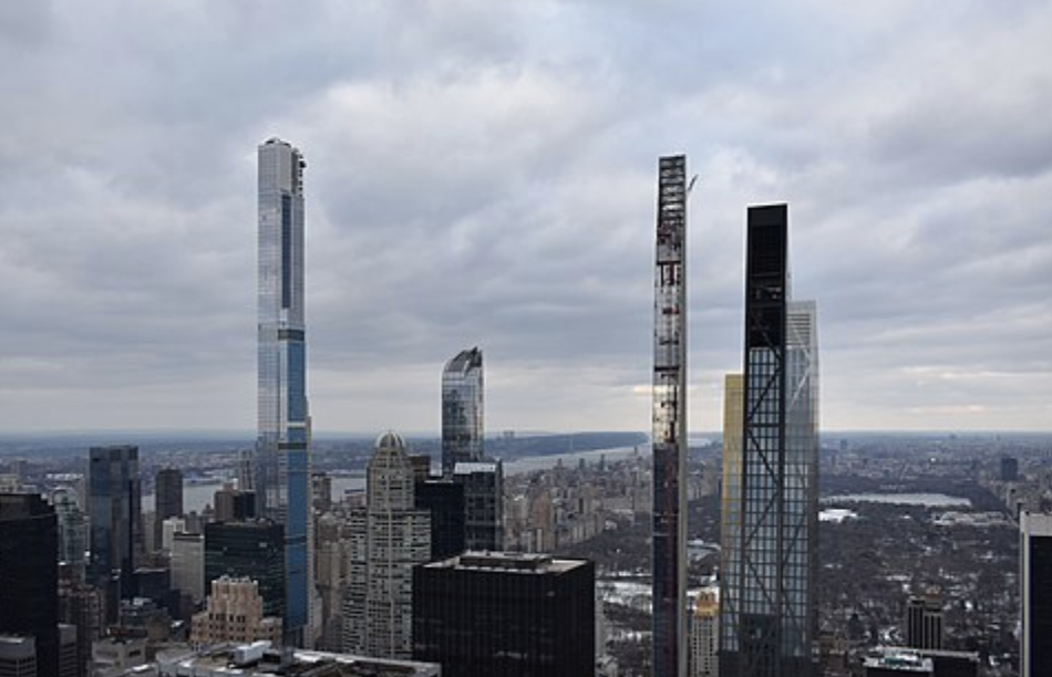
Each floor of the building is a single apartment with glass walls. Bernie’s vision on steroids.
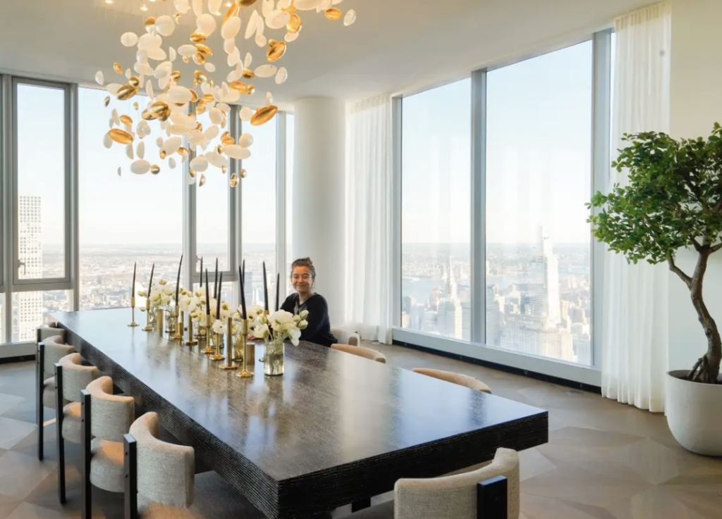
Manhattan’s skyline is ruined, but worse, it is an ecological nightmare. So tall are these buildings — one is 1,550 feet — that they cast shadows robbing Central Park of hours of sun. Now we are sad. These buildings kill trees,
Status in Interior Design
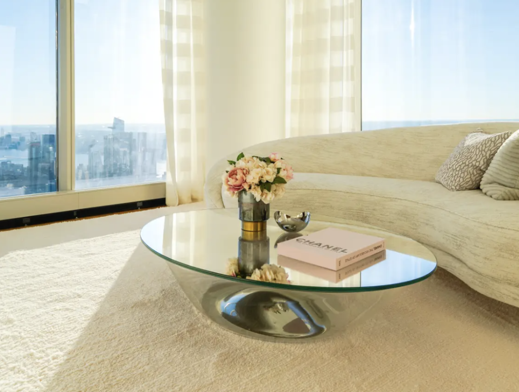
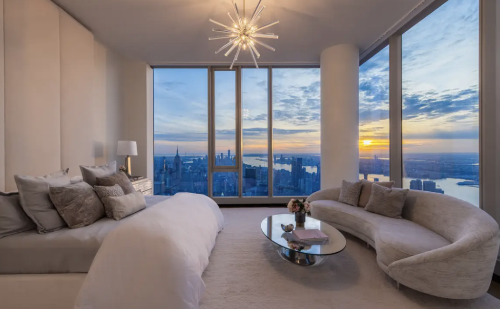
Design magazines always favored picturing the interiors of the rich and famous. Eighty to ninety percent of those interiors lack in pattern. Status was the message. It is impossible for people of modest means to make anything of such design examples.
Since COVID isolation, however, social media also bring us interior design. Speaking from their spacious homes, we get to see how the other side lives.

The Hidden Logos in Kitchens and Bathrooms
There are always majestic glass windows and symbols with marble, teak, stone, impeccable Italian design, and other patterns. There are no logos; their source you just have to know. The kitchens were crafted in custom cabinets with Wolf and Viking stoves and Thermidor and Subzero appliances. The bathrooms sport Villeroy & Boch, Paris Marble Sinks, and the Japanese Toto toilet.
The New “It” Factor
When Chrissy Teigen, the model and cookbook author, posted a photograph advertising her new line of lounge ware, thousands commented on her couch, a Bellini. Suddenly, everyone wanted one. All over Instagram, it is now the “it” sofa of the rich and famous. “It’s beautiful and bulbous,” British Vogue wrote, as if “a giant bunch of bubble wrap” wrapped itself “in voluptuous velvet.”
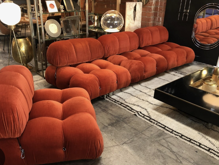
The sofa has good lines. I hope buyers chose it for its beauty and not to pose.
Intent of Possession
I don’t want to judge one’s need for designer products. They are well made and often save money in the end. Logos can also be beautiful. Berger calls a logo a signal; I call it a symbol in action designed to pull us to a certain behavior. And often only about posing.
Beauty can be imbedded in such objects. We can use it to pose, or we can use it to energize. [Why boldface?] Is it our ego connecting us to beauty, or is it our subliminal self, the part of which tickles our souls? Beauty doesn’t work to best another or elevate our position in life. It is an incredible gift from the Universe. Using it to make us feel more important than others is criminal. It starts to dim our eye for patterns and, in the end, for beauty itself. Our environment loses its harmony and depletes our energy.
In Conclusion
In metaphysical decorating, we find more peace, harmony, and energy. I discovered this principle working in inner-city schools. At first, I just wanted to stop vandalism, but soon I found myself also elevating the students’ self-perceptions. By making the environment appear rich, we offer them potential. This mirror of the future was designed to create advertisements, a kind of “advertising the Self to the self.” People’s belief systems and their environments exist in parallel. If poor self-esteem creates a poor environment, its reflection acts like a feedback loop on the observer. To change self-esteem, one must first change the mirror.
*****
Decorating is the mirror. Beauty is the energy. All beautiful objects are based on patterns. Beauty becomes a symbol of our potential self. It changes us and, in the feedback loop, create beauty. So, my decorated classrooms, enriched with the patterns of nature, became a symbol of self-worth and potential. The rooms’ designs messaged the students that they were worth more their poor environment made them think. I was connecting their egos to their souls.
Too often, however, beautiful items become symbolic for the ego. In so doing, we make mistakes. We cannot always see when the ego has taken over to distort a pattern like the boxwoods or Greek revival architecture. It becomes difficult to hold design ideas like colors in our minds. The ego can reverse the intended meaning of a patterned symbol. By paying insufficient attention to pattern, we choose uplifting symbols but often destroy the room’s energy. Don’t confuse beauty with status or allow other interests to impose symbols in our surroundings.
We Create Our Own Destinies
Kenneth Burke described man as “a symbol-using, symbol making, and symbol misusing animal.” He suggests that a person creates symbols as well as misuses them. Thus, we have a choice.
As human beings, we have tremendous power to design or have others design what we see and reinterpret it or have others interpret for us. We:
- Create or have others create our visual field. That is particularly true where we have no individual say, public space.
- Design or have others create what we see and then become affected by it.
- Make symbols, and like a feed-back loop, they give messages back to us. Often the effect is not in our best interest.
Creating Forward
I recommend we stop letting others choose our symbols for us and start choosing our symbols. We can place them to create scaffolding, which in itself is a symbol that can feed the unconscious aspects of the human persona. When we do that, we reflect ourselves to ourselves, for scaffolding based on nature and our physical being are the same. We advertise our true Self to the self, our subliminal spirits to our egos.
When we look at a beautiful article, one based on the geometry of nature, we see ourselves. A truly beautiful object and the human body have the same mathematical underpinnings to its scaffolding. Creating an article of beauty, we connect with it because it has the same geometrical structure of ourselves and the Universe. When we see this structure on subliminally, we experience a “rush.” We connect to the mathematics of creation.
It is my hope through these lessons we choose our symbols wisely. Even more importantly, I hope we manipulate them in our visual field to create the underlying symbol of reality. Our job in life is not to respond to product advertisements or the work of status designers. It is to design in the patterns of creation, to create symbols that nourish all parts of our being. Our job is to create an environment rich in the symbols that our subliminal self-desires and thus to advertise our potential self to the present self.
The trick to all of this is to understand that everything we see creates a pattern, that these patterns affect us. To decorate, we must learn to manipulate these patterns. We must choose the symbols that are good for us and build them into the design.
*****
There are two parts to this website, The Lessons, which are more difficult in concept, and the blogs, which are lighter in nature. Blogs that you might enjoy with with a similar theme to this lesson
One Lesson that relates to this lesson is:
Please note that my website allows you to leave comments at the end of the blogs but not at the end of each lesson. If you have a comment or question about a lesson, you may email me at ruta@rutas-rules.com
.